TACO BELL BRANDING
CHALLENGE
The project involves redesigning the Taco Bell logo and creating a 3-7 second animation to modernize the brand for commercials and web videos. The goal is to make Taco Bell feel fresh and cool again, targeting young adults.
RESEARCH
The "Bell" in Taco Bell comes from the lastame of the founder, Glen Bell. The name underwent several changes, from "Taco-Tia" to "El Taco," before finally settling on "Taco Bell." The latest logo was updated in 2016, making it simpler and more versatile, but many loyal customers criticized it as being a boring, large bell. Additionally, the small taco that was originally hidden inside the bell's clapper was removed, which disappointed some customers.
For More info on Client, click here
IDEATION
Since the current logo is criticized for being boring and unethical, the core goal is to strengthen the brand identity and make the logo more approachable. I referred to many successful fast food brand rebranding cases and tried to strengthen the taco element in the logo, and re-conceived the position and font of the word "TACO BELL".
CONCEPT 01:
The exploration of the neon lights that symbolize midnight allows hungry diners to find their way to Taco Bell.
Explore the various taco bell menu items and finally stop at the Taco Bell logo
CONCEPT 02:
A bold reimagining of the Taco Bell logo, where the iconic bell emerges from the strength and essence of the taco itself.
Symbolizing the brand’s vibrant energy and deep connection to its Mexican-inspired roots.
SELECTED BY CLIENT
CHOSEN LOGO
TACO COLORS
The red color is a reference to the hot sauce of Taco Bell, while the yellow represents the classic hard shell and is also the color of Chipotle sauce.
BELL COLORS
Both purple and yellow referenced the 1994 version, bright yellow make it more appealing when clapper swinging.
ANIMATION PROCESS
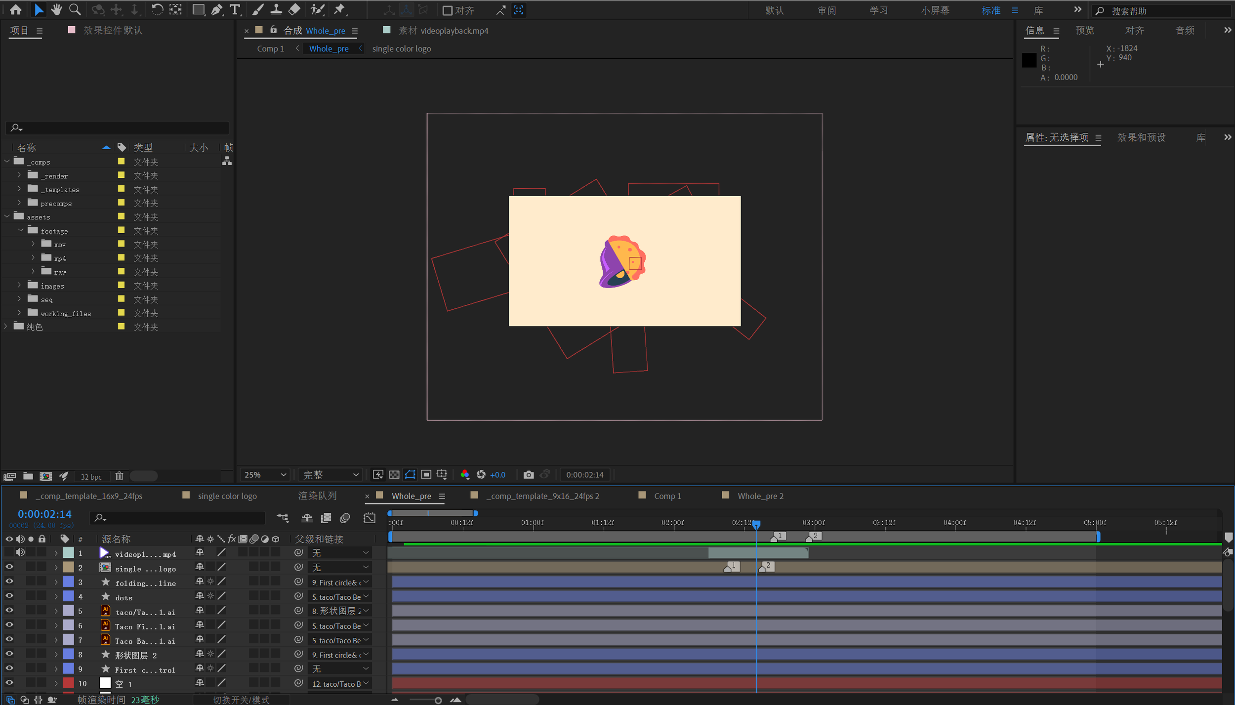
Visualize a droplet-shaped object hovering above a taco shell, symbolizing a source of energy. The droplet gradually descends, merging seamlessly with the taco shell as it is absorbed, representing the gathering and consolidation of energy. As the energy culminates, the taco takes form, symbolizing completion. From the center of the now fully-formed taco, a bell emerges, embodying the essence and origin of Taco Bell, connecting the imagery of energy, creation, and the brand's iconic symbol.
FINAL ANIMATIONS
What I learned from this project is that effective logo design doesn’t always require a complex concept; sometimes, simplicity and clarity are key.
16X9 format
9x16 format


